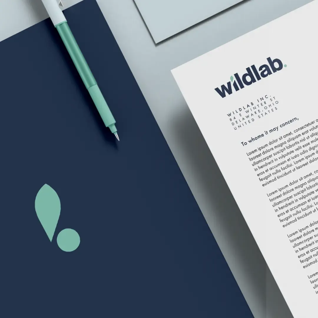
The Challenge
In a crowded—and often misleading—industry, wildlab wanted to bring a little more authenticity and pragmatism to the space. To do this, we had to merge some of the graphic playfulness seen in some brands and the scientific rigour seen in others. We had to dig deep, discover their story, and communicate in such a way that audiences knew that wildlab was a brand to trust with something so personal as their health.
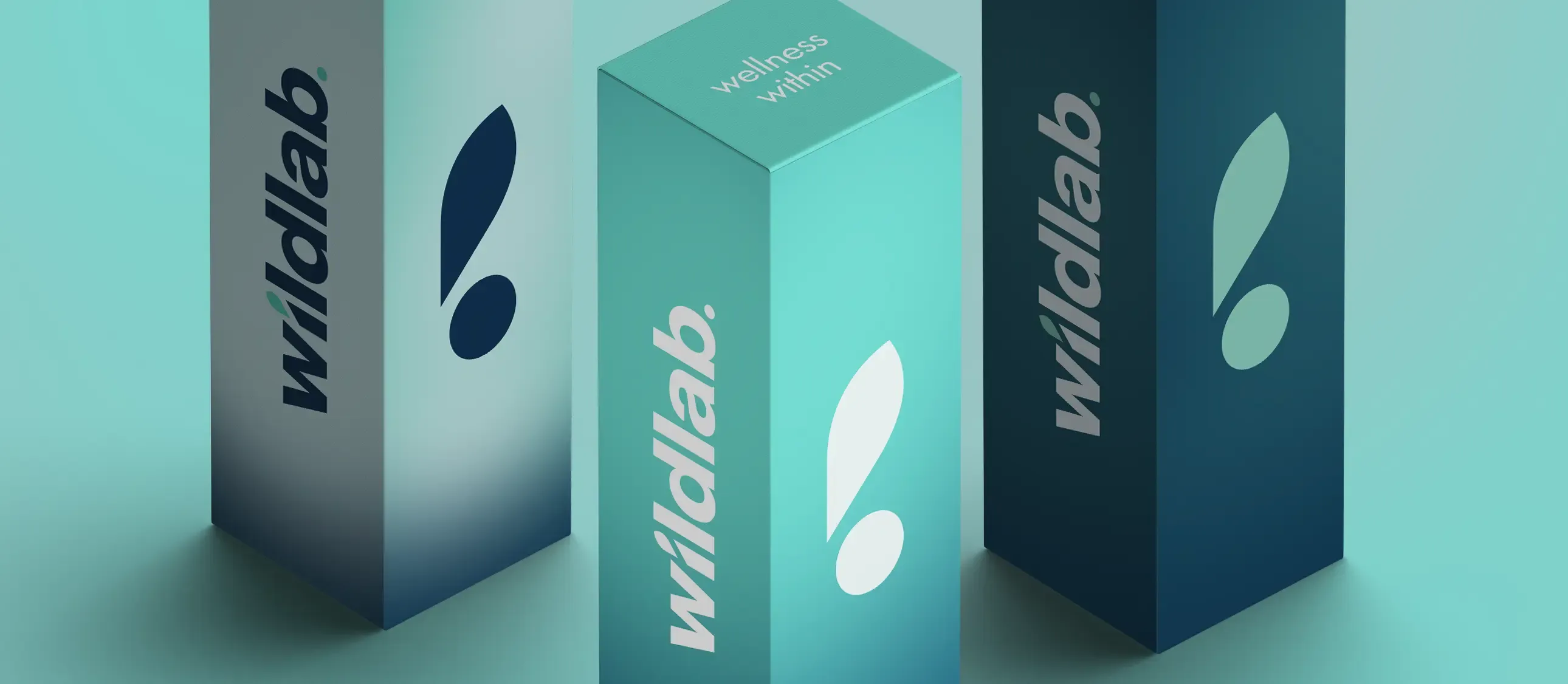
The Concept
For the last 2000 or so years, wellbeing—both physical and mental—has evolved and shifted with the prevailing cultural zeitgeist; giving rise to the sciences as we know them today. That being the case, we didn't want to forget the past in looking to the future, letting Wildlab's brand identity reflect this dichotomy of history and innovation.

The Learnings
A core audience is hard to win and even harder to keep in the short-term, but impossible to lose once won in the long term. Ideas underpinned by philosophy are emboldened beyond what they are alone. Less is more; subtle graphic flourishes make for detail that is only visible upon your second or third viewing.