The Challenge
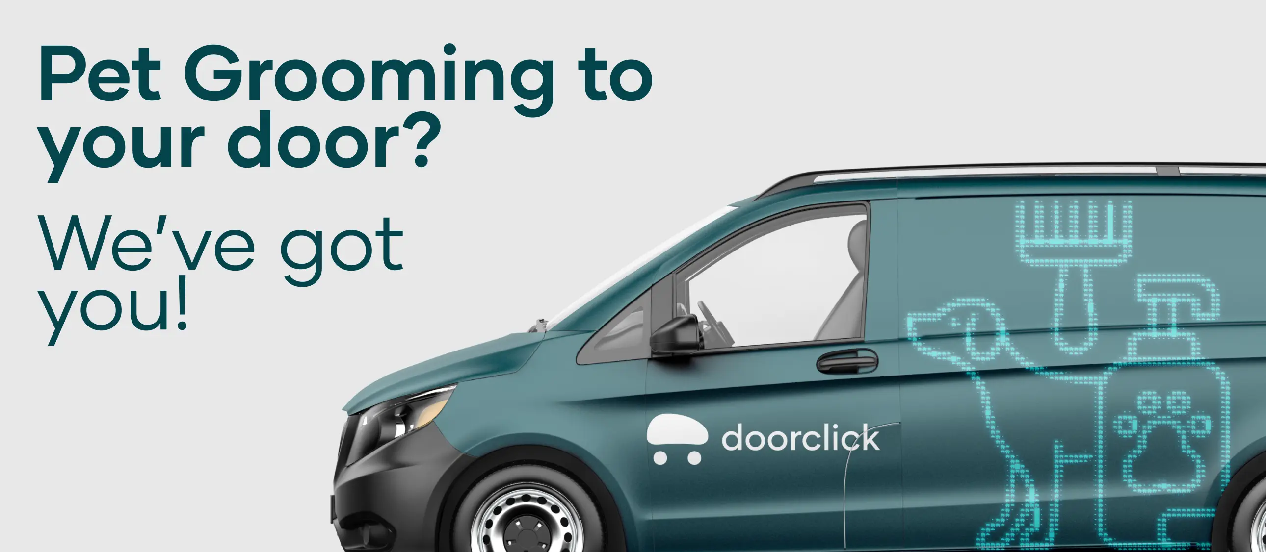
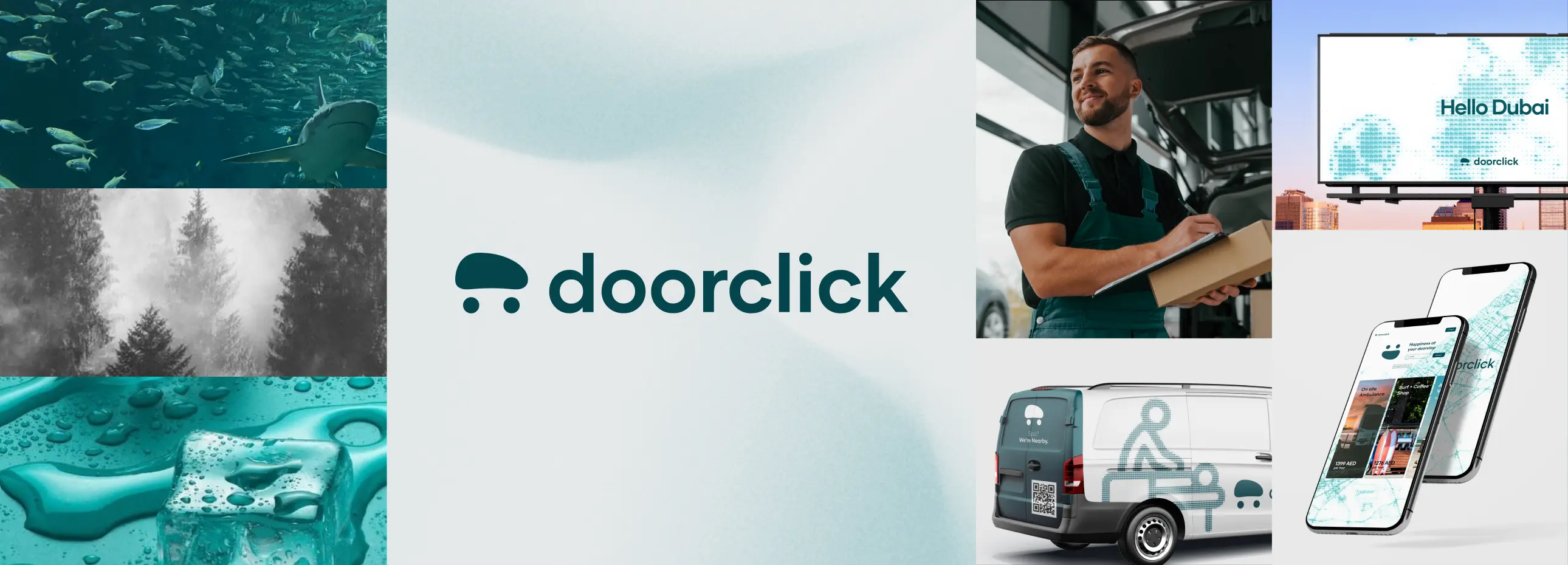
No matter where or who you might be, we all seemingly share an important deficit—time. That's what the DoorClick platform aimed to address. The Android/iOS applications aimed to bring together a diverse set of services under one platform, and allow them to transform into on-wheels versions of their brick-and-mortar businesses.
The Concept
Our demographic was twofold; on the one hand, the user needs to recognise the DoorClick brand amongst indirect competitors in the space, and on the other, business owners needed to sync with a brand identity that does not butt heads with their own. So we created a brand that best exemplifies these twin qualities whilst keeping the overall aesthetic clean and clutter-free. The personality we crafted for DoorClick now speaks to both the emotion users feel when their time is effectively saved, and the method by which business owners can meaningfully expand their operations.

The Learnings
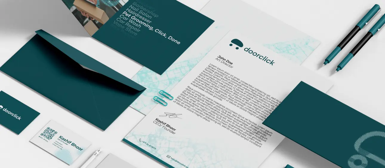
Whilst a logo is undoubtedly essential, a brand should be recognisable even without one. Colour exploration is an entire field of inquiry on its own, and should have adequate time allocated for it. Brevity is the soul of wit; to speak volumes, speak little.