
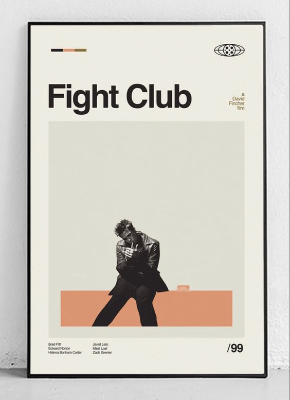
When it comes to "good design" in today's creative fields of application and website creation, chances are that certain common factors will pop into your head. Clean, simplistic, cookie-cutter approaches to typography and graphics are the key indicators of common design approach and general sense of creative direction.
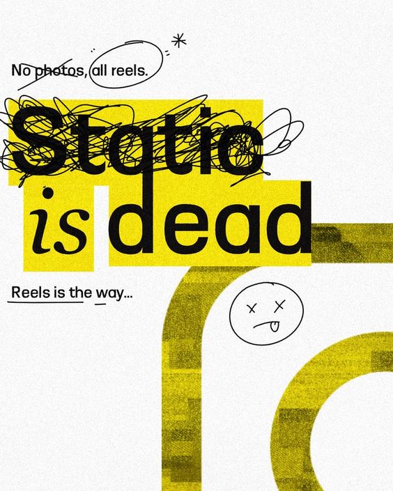
However, a recent trend takes the stage. Known as “anti-design”, this approach throws caution to the wind and rejects common design philosophy, choosing to break norms by using challenging layouts in favor of traditional design.
In this way, anti-design is meant to push the boundaries of what is now considered “best practice” and “common sense”, encouraging innovation, experimentation and the unorthodox.


Although this sort of approach can be applied to any medium, it’s mostly seen today to apply to apps and websites as part of the repackaging of a digital experience. That said, it’s hard to pin down what exactly anti-design stands for - it’s not a specific aesthetic, but a representation of thinking. In that sense, it’s key to understand what the “design” in “anti-design” means.
Definitive Design
Today, design is analogous with simplicity. Wise use of space, branded colors, perfectly aligned text and images. The idea is to maintain as simple a journey as possible to the user, while maintaining a semblance of aesthetic and intuition. The key is to have the user experience the journey without anything getting in the way, be it a jutting wall of text or a mismatched image, to provide as seamless an experience as possible.
The opposite can be held true for anti-design, as far as complexity.
A Deeper Understanding
It should be understood that anti-designers do not completely reject good design sense; but merely provide an alternative to what is seen as an accepted convention, a stagnation of creativity for the digital landscape. It doesn’t turn its back on simplicity or ease, but rather allows creatives to explore the experiences one can provide to anyone using apps and websites.
Today, a few common characteristics can be seen in all anti-design implementations:
By its very nature, anti-design is a reaction to common design philosophy - its very name describes what it is not. As conventional design is subject to change, so is anti-design, and therefore, a very experimental undertaking.
Not a New Concept
Although with very different outcomes, anti-design has been known throughout society since the 1960s, beginning with an Italian industrial design movement that migrated to the US. Focused on a different industry, this serves to demonstrate the constant tug-and-pull between accessibility and creative freedom.
The 90’s and its infamous reliability on gaudy aesthetic and experimental design format could reflect the anti-design philosophy as well. The barren wastelands of the initial World Wide Web proved to be a playground for designers and artists to experiment on. This, in turn, may be proved by the “Y2K aesthetic” popularized in recent social media, yet another turn towards a rejection of trends and norms.
After the 90s, the introduction of smaller, more compact technologies and screens necessitated the use of more compact designs, eventually leading to the cookie-cutter approaches we see in modern app and website design.
The Perfect "When" and "How"
Being an experimental approach means that this philosophy will not apply to every project that’s out there. The explosive, out-of-the-box, and complex facets of design that will be brought out will not apply to every client or user out there.
It’s not a universally-accepted approach to design. In fact, there are some who argue the point of such a design - arguing that this sort of approach only works for those whose intended audiences are designers who understand the nuances behind the work, and otherwise will only confuse and turn away regular users.
There are still reasons to adopt this style, though:
To this end, it may be wise to implement this approach to projects with a more creative outlook as opposed to projects with strict guidelines and a brand that requires a focused, definitive style.
It may be strange to consider a design approach that is somewhat dependent on another. Anti-design is defined by general design tactics and standards of the current time, so it’s had a fluctuating image as the years pass. Yet, it’s praised by its upholders as a style that’s cyclical and responsive as can be.
An interesting mentality to preach. The human race innovates and grows when it steps out of its comfort zone in an effort to break away from the mold, but is that something that applies to something as esoteric as design?
There’s no doubt that design can stagnate, that the human mind can get bored from seeing the same layouts and repeating the same patterns as time goes by. That is how the Anti-Design philosophy was created and popularized, and will continue to define itself by that standards in the years to come.
However, it’s not a thing that is easily accepted. Being away from the norm means that a majority of viewers may not agree with the approach, ignoring the “best” practices and “common” sense. Yet, there may always be a place for this design as part of the perfect project.
With memorability and uniqueness as its strongest selling points, one cannot easily discount the value of such a philosophy.